After a 30-day countdown Yahoo has unveiled its new logo.
The redesigned logo was unveiled on September 5, with the company saying that the new symbol was designed to stay true to their roots, but that it embraced the evolution of their products.
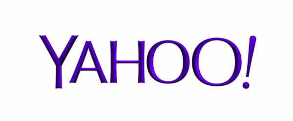
The logo is shown in purple spelling out the word Yahoo!, with no letters touching and ending with an exclamation point.
It’s a slightly serif, 3d looking design that should help the logo pop-out more on mobile devices.
The redesign is part of a continuing makeover Yahoo has undergone since former Google executive Marissa Mayer became CEO 14 months ago.
She has already changed Yahoo’s front page, email and Flickr photo-sharing service, as well as engineering a series of acquisitions aimed at attracting more traffic on mobile devices.
The shopping spree has been highlighted by Yahoo’s $1.1billion (£720m) purchase of Tumblr, the blogging service, where the company rolled out its new logo.
In a statement, Yahoo said: ‘We’re excited to share the new Yahoo logo with you below. We wanted a logo that stayed true to our roots (whimsical, purple, with an exclamation point) yet embraced the evolution of our products’.
In an effort to drum up more interest in the changeover, Yahoo spent the past 30 days showing some of the proposed logos that Ms Mayer and other executives cast aside.
The revision is the first time that Yahoo has made a significant change to its logo since a few tweaks shortly after co-founders Jerry Yang and David Filo incorporated the company in 1995.